Arctic Excursions
Our logo is a whale tail
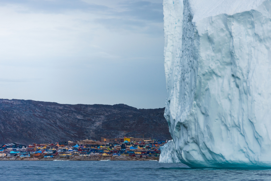
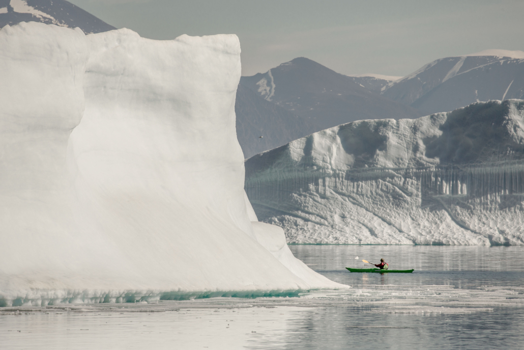
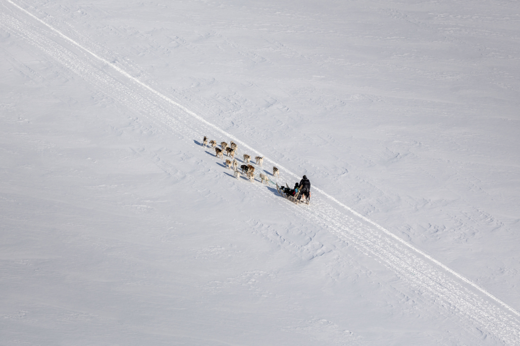
Nature and Wilderness
The whale fin is a symbol of the vast wilderness of our country.
Our logo is meant to create a sense of adventure and exploration, appealing to travelers who seek unique experiences in natural settings.
Cultural Significance
Whales have cultural significance for our people.
They are a part of our traditional hunting practices and hold spiritual importance.
Our logo pays tribute to this cultural heritage.
Conservation and Sustainability
The whale tail also symbolizes our dedication to nature conservation and environmental sustainability.
It signals that we are committed to protecting the ecosystem and its inhabitants.
Logo and backgrounds
White on Red – Primary Logo
- White on Red – Primary Logo Utilize the white logo on a red background as the primary representation.
- Employ the white logo on a red background when incorporating it into image backgrounds or colored backgrounds.
- The red background surrounding the white logo ensures a consistently strong logo presence, regardless of the context.
- The logotype should be shown together with the brand mark at all times
Black on white – only B/W printing
Red on white
– SPECIAL OCCATIONS ONLY!
- FOR SPECIAL OCCASIONS ONLY! Avoid enclosing the logo within a white box against background images!
- Resort to this option only when there is a compelling reason not to use the white on red logo.
- The logotype should be shown together with the brand mark at all times
Clearspace
Ensure the masterbrand signature stands out with prominence and visibility; avoid overcrowding it with text or other graphics. The minimum clear space, as presented on the opposite side, should be expanded whenever possible. The recommended location for this mark is either at the top right or bottom right of the application.