Hotel Arctic – Our logo is an igloo
Cultural Relevance
Igloos have strong cultural significance in our country. They are traditional Inuit dwellings made of snow blocks or ice, historically used as winter shelters. The igloo in our logo honors this cultural heritage while signaling that we provide our guests with a temporary home.
Arctic Location
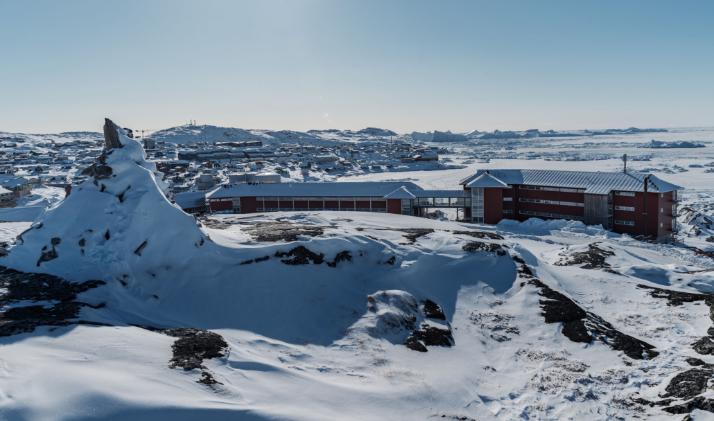
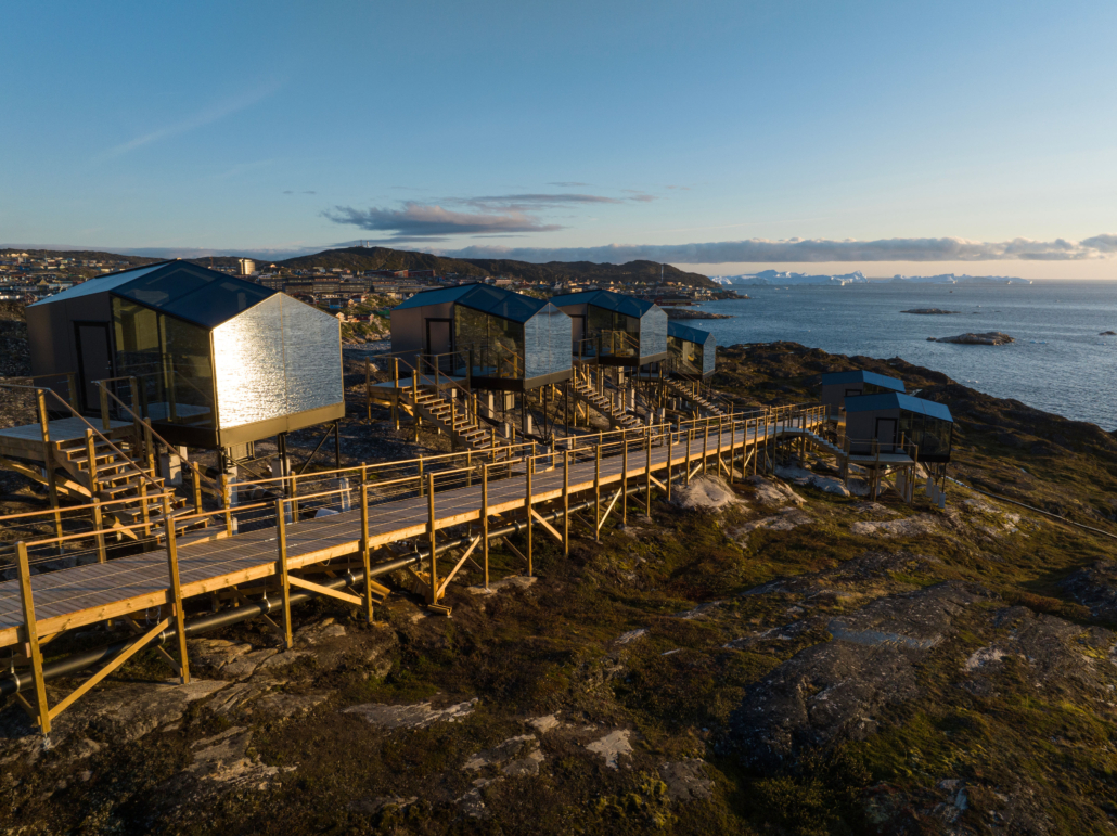
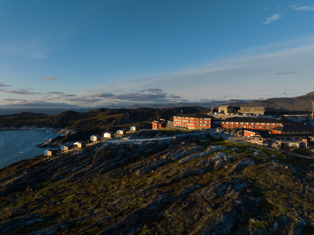
Our country is known for its Arctic landscape, icebergs, and snow-covered terrain. The igloo symbolizes this harsh yet stunning environment, thereby showcasing our hotel’s unique location.
Uniqueness and Exclusivity
The igloo logo sets our hotel apart from other accommodations worldwide, emphasizing to our guests that we offer an exclusive Arctic experience.
Logo and backgrounds
White on Red
- White on Red – Primary Logo Utilize the white logo on a red background as the primary representation.
- Employ the white logo on a red background when incorporating it into image backgrounds or colored backgrounds.
- The red background surrounding the white logo ensures a consistently strong logo presence, regardless of the context.
- The logotype should be shown together with the brand mark at all times
Black on white – only B/W printing
Red on white
– SPECIAL OCCATIONS ONLY!
- FOR SPECIAL OCCASIONS ONLY! Avoid enclosing the logo within a white box against background images!
- Resort to this option only when there is a compelling reason not to use the white on red logo.
- The logotype should be shown together with the brand mark at all times
Clearspace
Ensure the masterbrand signature stands out with prominence and visibility; avoid overcrowding it with text or other graphics. The minimum clear space, as presented on the opposite side, should be expanded whenever possible. The recommended location for this mark is either at the top right or bottom right of the application.